The situation
The project started in 2021 when everyone was still cautious of COVID-19.
Active mobile app usage was down because its main use was to generate cinema and restaurant discount codes (aka “rewards”), but cinema/restaurant visitor numbers were significantly lower than 2019.
In addition, the CEO and CPO believed the app should be more balanced between product comparison and rewards, and that many usability issues reported with the app hadn't been addressed for a long time.

The mission
Make the app more balanced between sales and rewards, and fix the problems customers were having using discounts.
The mission
Make the app more balanced between sales and rewards, and fix the problems customers were having using discounts.
The business goals
Increase monthly active users, product sales and revenue share generated using the mobile apps whilst improving ease of use to reduce call centre enquiries.
SUCCESS METRICS
Sales numbers via the app
App revenue share
Monthly active users
App store downloads
Customer service call numbers
The design process
This was an highly iterative design process. User testing was used to test both existing and new designs to really understand the typical mental modals for using each of the features.

The design process
This was an highly iterative design process. User testing was used to test both existing and new designs to really understand the typical mental modals for using each of the features.
The design process
This was an highly iterative design process. User testing was used to test both existing and new designs to really understand the typical mental modals for using each of the features.
Existing UX research
Compare the Market had a dedicated UX research team that had many years' worth of insights between them.
I arranged meetings with the researchers that had the most exposure to the mobile app and discount claiming journeys.
They informed me of known usability problems. For example, very few customers realised the golden button in the top right was how you generated a discount code.
Usage metrics
I asked an optimisation team member to grant me access to Google Analytics and explain the metric naming system.
I gained an understanding on the most commonly used features of the app and analysed 2 sets of metrics:
Pre-covid
Post-covid

Usage metrics
I asked an optimisation team member to grant me access to Google Analytics and explain the metric naming system.
I gained an understanding on the most commonly used features of the app and analysed 2 sets of metrics:
Pre-covid
Post-covid
Usage metrics
I asked an optimisation team member to grant me access to Google Analytics and explain the metric naming system.
I gained an understanding on the most commonly used features of the app and analysed 2 sets of metrics:
Pre-covid
Post-covid
App store reviews analysis
Using an online service called ‘data.ai’, I exported review data from the past year into an excel spreadsheet.
I then used Excel logic functions to filter out irrelevant reviews and put reviews into categories to discover the areas complained about the most.

App store reviews analysis
Using an online service called ‘data.ai’, I exported review data from the past year into an excel spreadsheet.
I then used Excel logic functions to filter out irrelevant reviews and put reviews into categories to discover the areas complained about the most.
App store reviews analysis
Using an online service called ‘data.ai’, I exported review data from the past year into an excel spreadsheet.
I then used Excel logic functions to filter out irrelevant reviews and put reviews into categories to discover the areas complained about the most.

Remote workshop
I planned, organised and facilitated a 2-day workshop with ~15 project stakeholders to decide which problems to focus on.
Workshop output
Following an affinity mapping and prioritisation exercise, we agreed to focus on the 3 problems we believed had the biggest impact on sales performance and customer satisfaction.

Workshop output
Following an affinity mapping and prioritisation exercise, we agreed to focus on the 3 problems we believed had the biggest impact on sales performance and customer satisfaction.
Workshop output
Following an affinity mapping and prioritisation exercise, we agreed to focus on the 3 problems we believed had the biggest impact on sales performance and customer satisfaction.
App flow diagram
Before starting on design, I wanted to make sure I understood how the various functions of the mobile app worked together.
I mapped the entire mobile app out, starting with the areas most relevant to the problems we wanted to solve.

App flow diagram
Before starting on design, I wanted to make sure I understood how the various functions of the mobile app worked together.
I mapped the entire mobile app out, starting with the areas most relevant to the problems we wanted to solve.
App flow diagram
Before starting on design, I wanted to make sure I understood how the various functions of the mobile app worked together.
I mapped the entire mobile app out, starting with the areas most relevant to the problems we wanted to solve.
Design
Each problem needed to be addressed as part of the optimisation, so I had to think about how each design change would affect the other.
There were also 3 initial release phases, so the design changes would be gradually introduced over time.
Design
Each problem needed to be addressed as part of the optimisation, so I had to think about how each design change would affect the other.
There were also 3 initial release phases, so the design changes would be gradually introduced over time.
Design
Each problem needed to be addressed as part of the optimisation, so I had to think about how each design change would affect the other.
There were also 3 initial release phases, so the design changes would be gradually introduced over time.
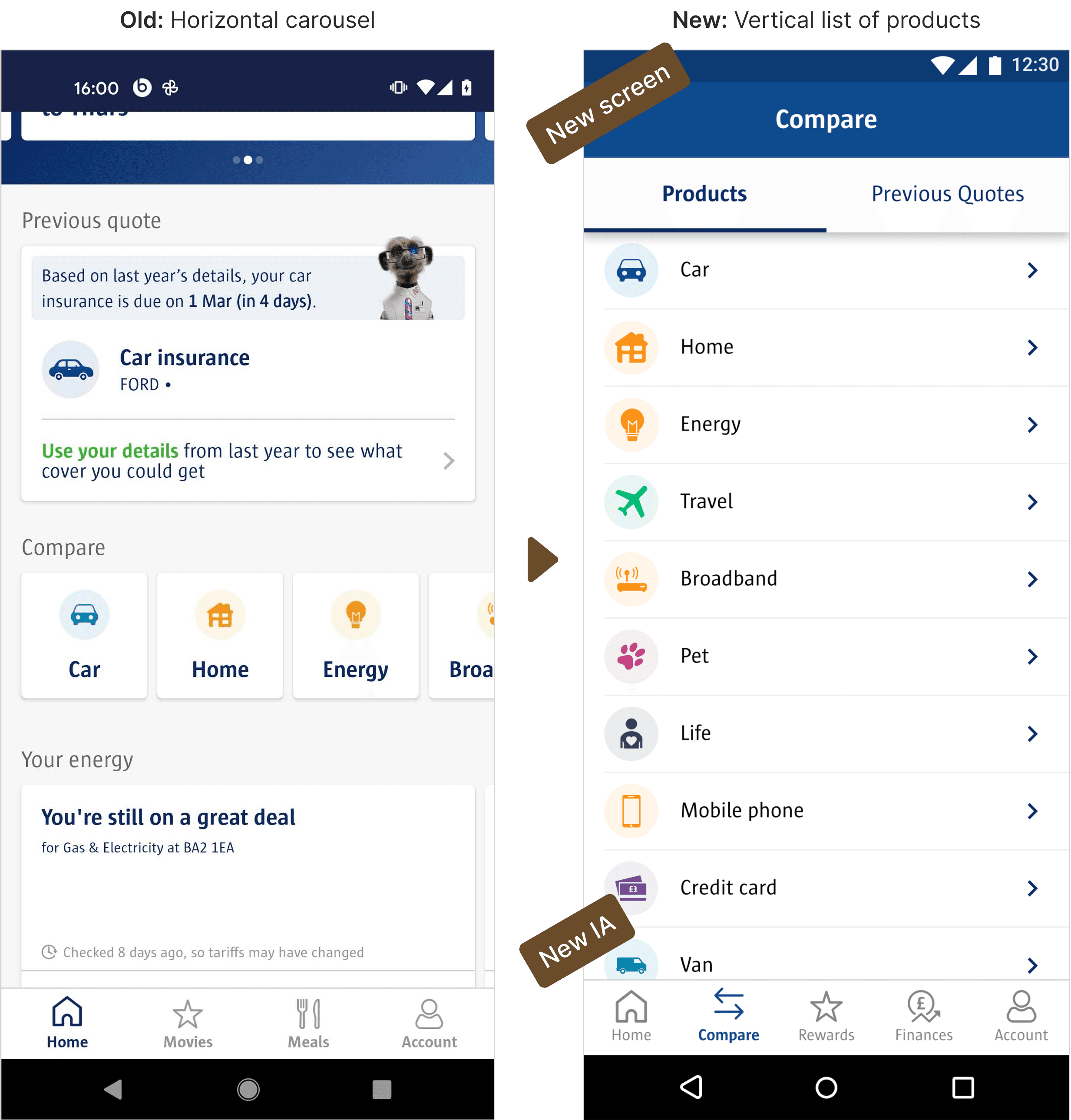
Information architecture
It was a combination of removing what wasn’t needed, moving relevant features together, and tweaking what was already there.
The company was also quite risk-averse and cautious of change, so I only changed what was necessary to achieve the business goals.
Information architecture
It was a combination of removing what wasn’t needed, moving relevant features together, and tweaking what was already there.
The company was also quite risk-averse and cautious of change, so I only changed what was necessary to achieve the business goals.
Information architecture
It was a combination of removing what wasn’t needed, moving relevant features together, and tweaking what was already there.
The company was also quite risk-averse and cautious of change, so I only changed what was necessary to achieve the business goals.
Further tweaks
Some changes were very simple but would later have a huge impact.
Further tweaks
Some changes were very simple but would later have a huge impact.
Further tweaks
Some changes were very simple but would later have a huge impact.
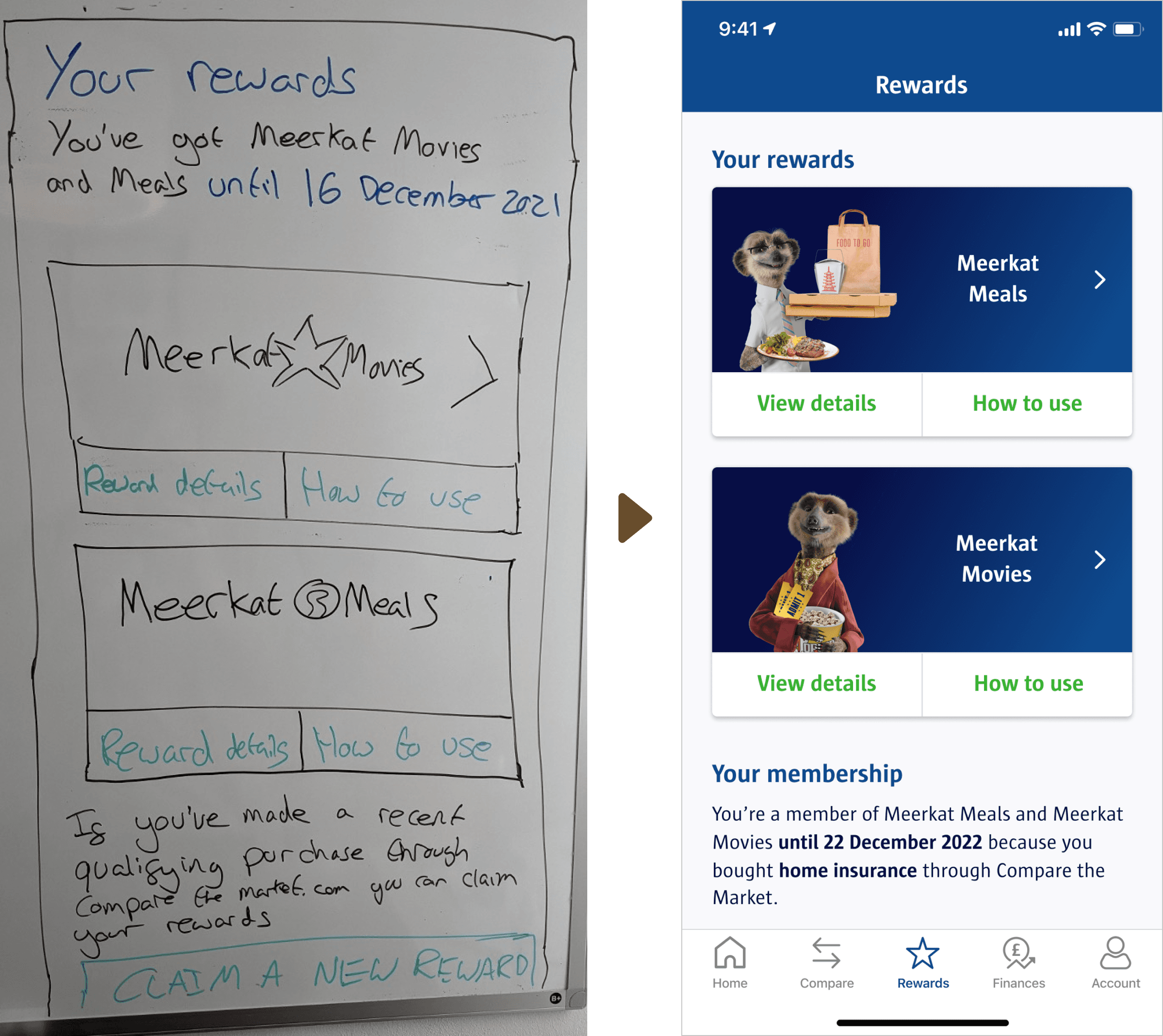
Added a button to the banner and a search bar
Moved rewards out of the account tab
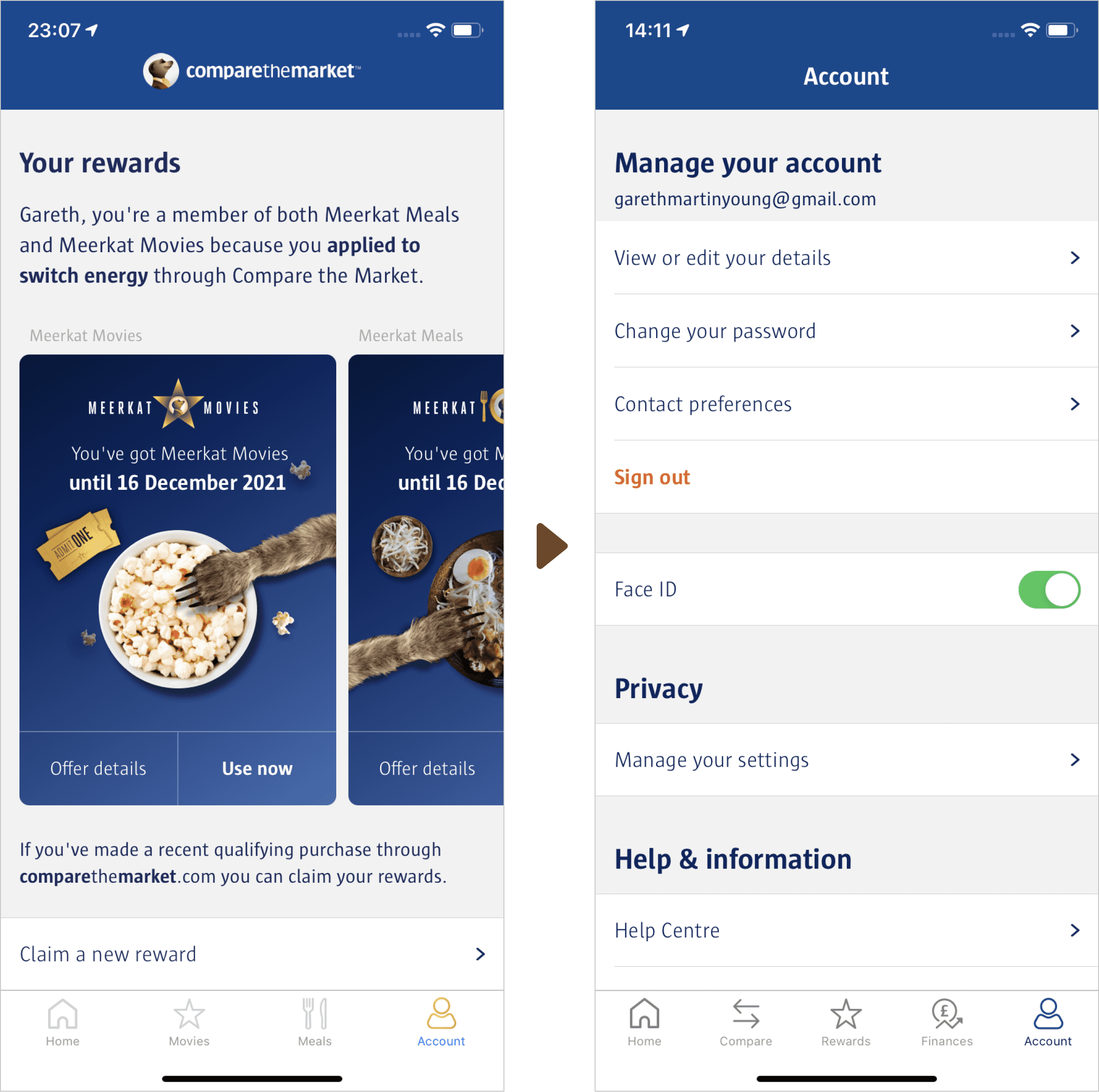
Added a button to the banner and a search bar
Moved rewards out of the account tab
Added a button to the banner and a search bar
Moved rewards out of the account tab
Advanced prototyping and user testing
I created an advanced Axure prototype that behaved almost exactly like the actual mobile app to get the most realistic behaviour in user tests.
UserZoom was the tool I used to create and launch unmoderated user tests due to no available user researchers.
I went through 3 rounds of user testing before finalising designs for the first launch.
Unexpected results
I wanted to add shortcuts to the homescreen to allow quick access to movie and discount codes.
However, turns out more shortcuts does not always mean faster and easier.
In user tests, the vast majority hit the first button that even somewhat resembled what they were looking for. So I stuck with 1 shortcut per reward type.
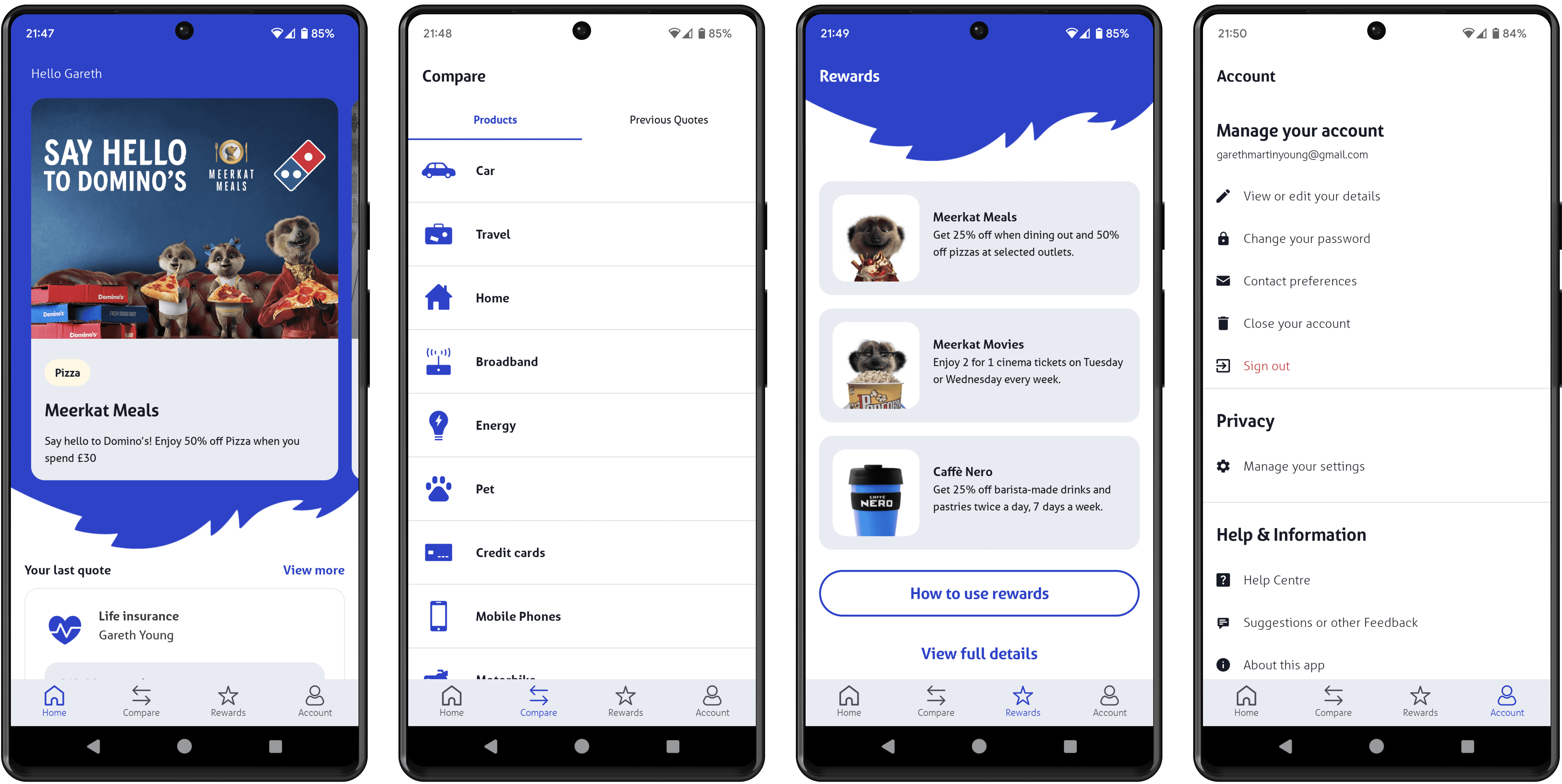
New designs and IA
I put the new designs together, and following their launch there were significant increases in sales and reward redemptions via the app.
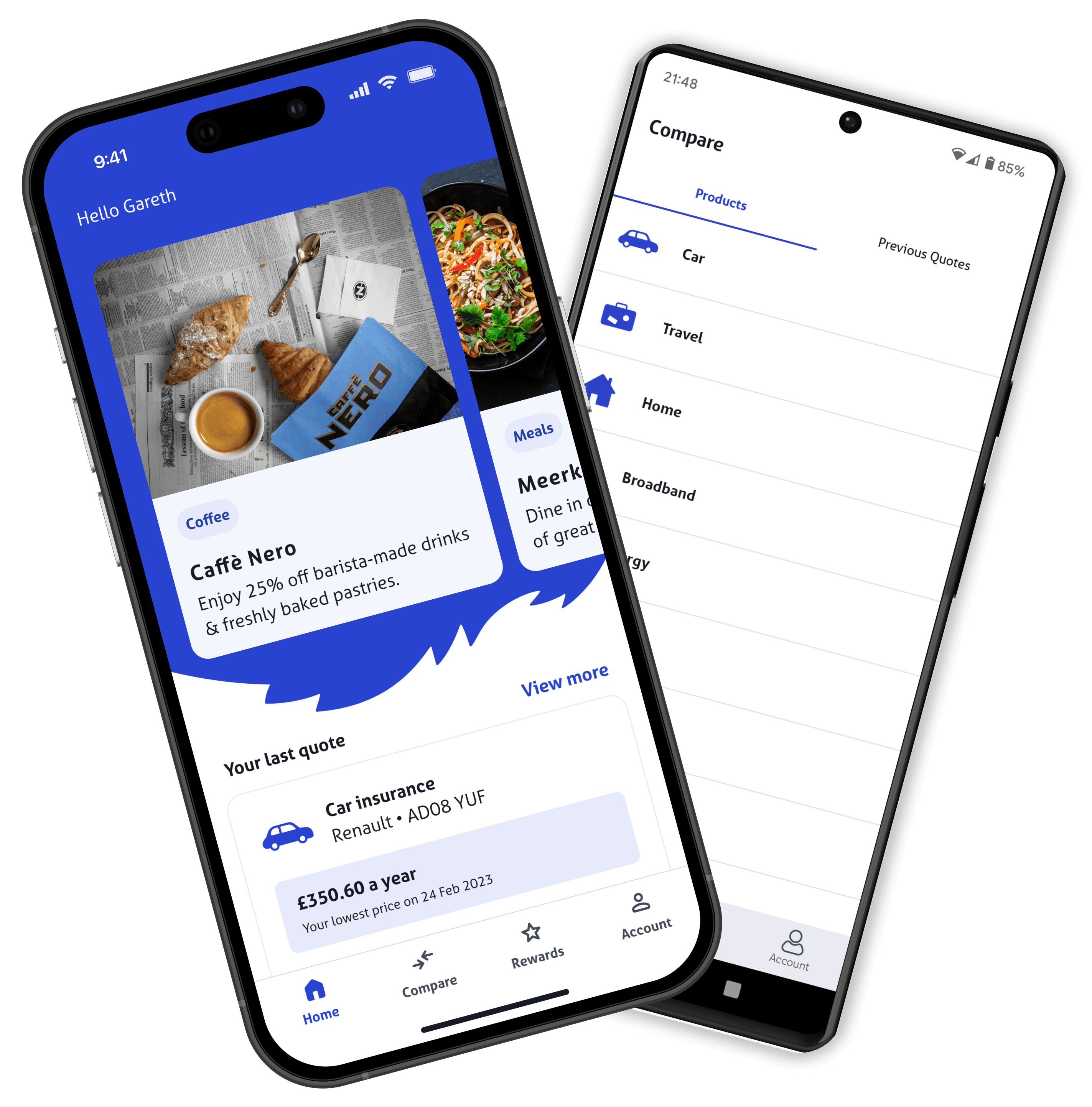
The new IA also allowed for more than 2 rewards, which came in handy when the Caffè Nero reward arrived.

New designs and IA
I put the new designs together, and following their launch there were significant increases in sales and reward redemptions via the app.
The new IA also allowed for more than 2 rewards, which came in handy when the Caffè Nero reward arrived.
New designs and IA
I put the new designs together, and following their launch there were significant increases in sales and reward redemptions via the app.
The new IA also allowed for more than 2 rewards, which came in handy when the Caffè Nero reward arrived.

But we weren't done yet...
... because Compare the Market's brand had a refresh!
App reskin
An agency provided us with the new brand colour palette and a library of new Figma components to work with for light and dark modes. So we used these to create new screens for the entire mobile app.
Note the business also decided to discontinue bank account spending analysis, resulting in needing one less tab.
Light Mode
Light Mode
Light Mode
Dark Mode

Dark Mode
Dark Mode
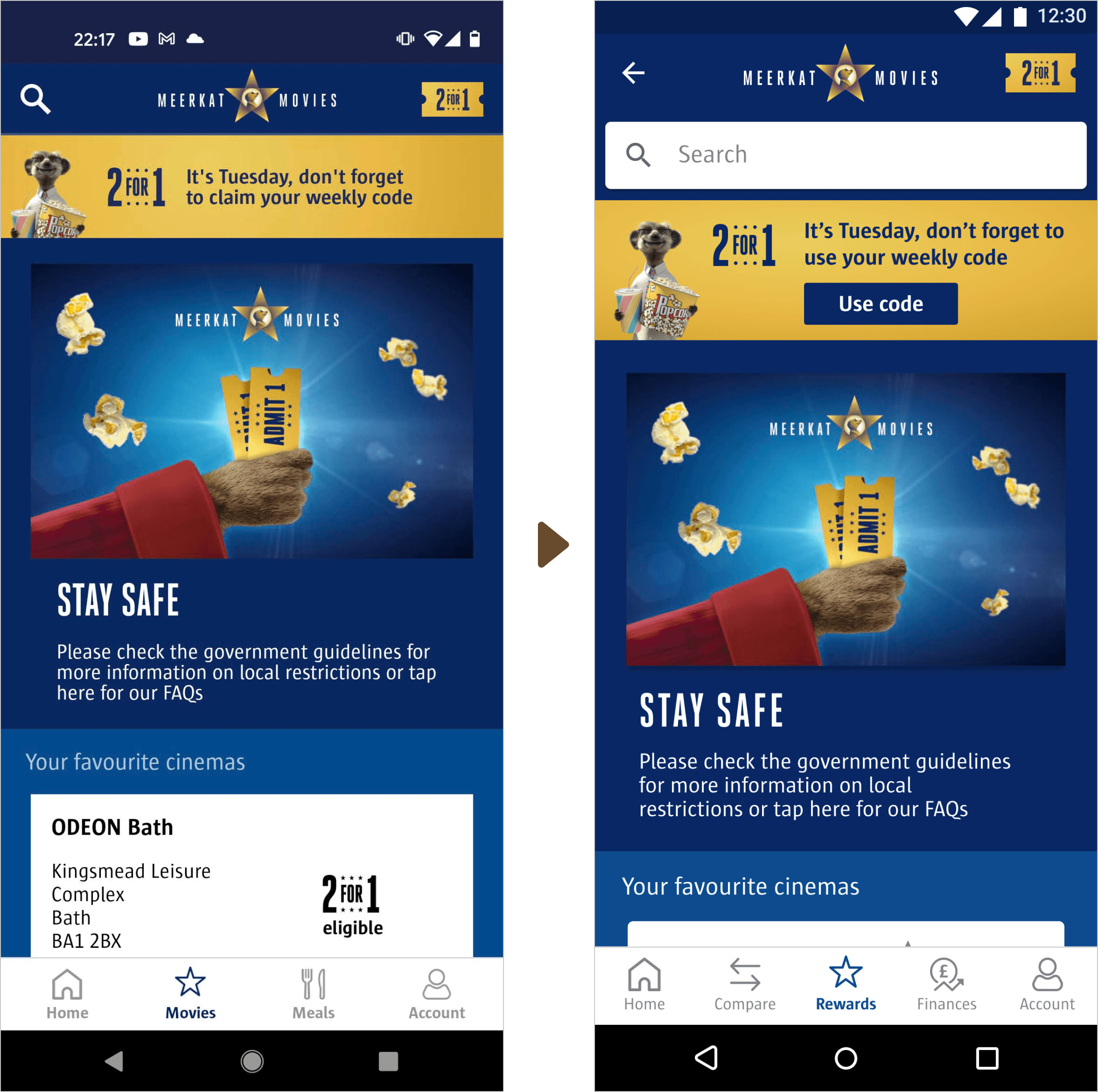
Optimisations continued
Each area was re-evaluated as it was reskinned to see if we could improve it further.
For example, we placed a sticky '2 for 1 code' button on every movie-related screen to make it easier to get the code from anywhere.
Plus, we only showed the days the offer was available to simplify using it.
Project outcomes
The redesign helped contribute to:
Revenue generated by the app increased by ~40% YoY by May 23.
Significant uplift in discount code usage across movie, restaurant and coffee rewards.
iOS and Android app store ratings went from 3 stars to 4.8.

Project outcomes
The redesign helped contribute to:
Revenue generated by the app increased by ~40% YoY by May 23.
Significant uplift in discount code usage across movie, restaurant and coffee rewards.
iOS and Android app store ratings went from 3 stars to 4.8.
Project outcomes
The redesign helped contribute to:
Revenue generated by the app increased by ~40% YoY by May 23.
Significant uplift in discount code usage across movie, restaurant and coffee rewards.
iOS and Android app store ratings went from 3 stars to 4.8.