Ecommerce website
Travel Insurance Comparison
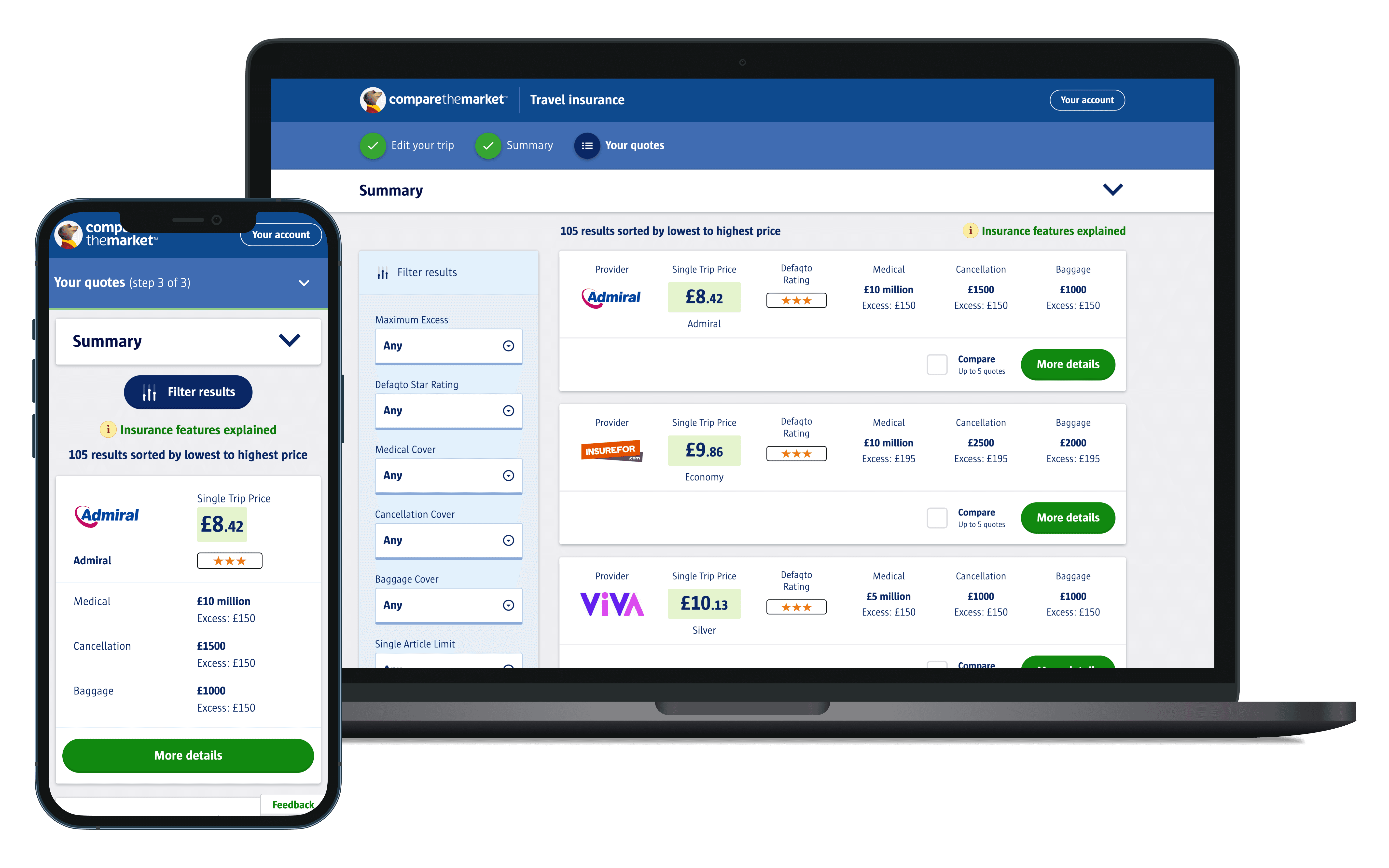
Optimising Compare the Market's travel insurance website used by 6 million people a year.

Ecommerce website
Travel Insurance Comparison
Optimising Compare the Market's travel insurance website used by 6 million people a year.
Ecommerce website
Travel Insurance Comparison
Optimising Compare the Market's travel insurance website used by 6 million people a year.
The situation
A quantitative UX researcher's benchmarking revealed several usability issues with the results page.
The UI and copy were confusing, disorganised, cluttered, and poorly aligned.
This was particularly important as Travel insurance is one of Compare the Market's highest priority products.
I was the sole designer on the project and all the work showcased is my own except the existing research I reviewed at the start.

The challenge
Optimise the results page design to increase conversion
The design process
This project was about delivering as many quick fixes as possible to get the design of the results page to a high standard without overhauling the entire user journey.
This meant discovery research was minimal, but I made good use of existing research and the optimisation team regularly ran AB tests.
Existing research
I reviewed the previous qualitative and quantitative research conducted on travel insurance.

Existing research
I reviewed the previous qualitative and quantitative research conducted on travel insurance.
Existing research
I reviewed the previous qualitative and quantitative research conducted on travel insurance.
Hueristic evaluation
I reviewed the existing travel insurance results page, and made notes on parts that were likely negatively affecting conversion.

Hueristic evaluation
I reviewed the existing travel insurance results page, and made notes on parts that were likely negatively affecting conversion.
Hueristic evaluation
I reviewed the existing travel insurance results page, and made notes on parts that were likely negatively affecting conversion.
Customer feedback
I checked the Travel insurance product journey comments made via the on-page 'Feedbackify' control to see if there were any common themes in the negative feedback.

Customer feedback
I checked the Travel insurance product journey comments made via the on-page 'Feedbackify' control to see if there were any common themes in the negative feedback.
Customer feedback
I checked the Travel insurance product journey comments made via the on-page 'Feedbackify' control to see if there were any common themes in the negative feedback.
Competitor analysis
I performed a competitor analysis across MoneySupermarket, Go.Compare and Confused.com.
Travel Insurance provider websites were also reviewed to discover common design and copy patterns within the sector.

Competitor analysis
I performed a competitor analysis across MoneySupermarket, Go.Compare and Confused.com.
Travel Insurance provider websites were also reviewed to discover common design and copy patterns within the sector.
Competitor analysis
I performed a competitor analysis across MoneySupermarket, Go.Compare and Confused.com.
Travel Insurance provider websites were also reviewed to discover common design and copy patterns within the sector.

Wireframing
Prototyping
prototyping
prototyping
I created prototypes of new interactions using Axure. This is one I made of a sticky 'Update results' button to stop people missing it.
Note that updating results is sometimes a big commitment page load time-wise. Otherwise I would have made the results update instantly upon changing a filter.
Optimised designs
I designed optimised versions of each section of the results page, and rearranged these sections based on e-commerce best practice and previous AB test results from similar products.
Optimised designs
I designed optimised versions of each section of the results page, and rearranged these sections based on e-commerce best practice and previous AB test results from similar products.
Optimised designs
I designed optimised versions of each section of the results page, and rearranged these sections based on e-commerce best practice and previous AB test results from similar products.
Old Results Page

Optimised Results Page


Old Product Details Layout

Optimised Product Details Layout

Old Comparison Table

Optimised Comparison Table

Click tests
I used click tests and UX team meetings as a quick way to sanity check my designs before handing them over to development.

Click tests
I used click tests and UX team meetings as a quick way to sanity check my designs before handing them over to development.
Click tests
I used click tests and UX team meetings as a quick way to sanity check my designs before handing them over to development.
Post-it note handover strategy
Each design/copy change had a bold, bright post-it note next to it in Figma. And each post-it had 4 visual states:
1. Default
2. Approved by product management
3. Implemented by engineering
4. Design change abandoned

Post-it note handover strategy
Each design/copy change had a bold, bright post-it note next to it in Figma. And each post-it had 4 visual states:
1. Default
2. Approved by product management
3. Implemented by engineering
4. Design change abandoned
Post-it note handover strategy
Each design/copy change had a bold, bright post-it note next to it in Figma. And each post-it had 4 visual states:
1. Default
2. Approved by product management
3. Implemented by engineering
4. Design change abandoned
My 3-phase release plan
my 3-phase release plan
my 3-phase release plan
I decided to split the page redesign into 3 manageable chunks to make it less daunting for project stakeholders.


Funnel metrics
Throughout the project I closely monitored the funnel metrics of each step of the Travel Insurance product journey.
The data/optimisation team also ran regular AB tests to track changes in conversion.

Funnel metrics
Throughout the project I closely monitored the funnel metrics of each step of the Travel Insurance product journey.
The data/optimisation team also ran regular AB tests to track changes in conversion.
Funnel metrics
Throughout the project I closely monitored the funnel metrics of each step of the Travel Insurance product journey.
The data/optimisation team also ran regular AB tests to track changes in conversion.
Project outcomes
Helped improved conversion on the results page by ~11%pts (Jan vs Sep 2023), resulting in a significant amount of extra revenue per year.
Nearly every change suggested was approved by Product and shipped.
The handover methodology proved popular with Product and Engineering, so its use continued for other projects.
