Vehicle infotainment system
Mid-air gesture vehicle system
Designing an infotainment system that can be easily controlled using mid-air gestures and haptics.

The situation
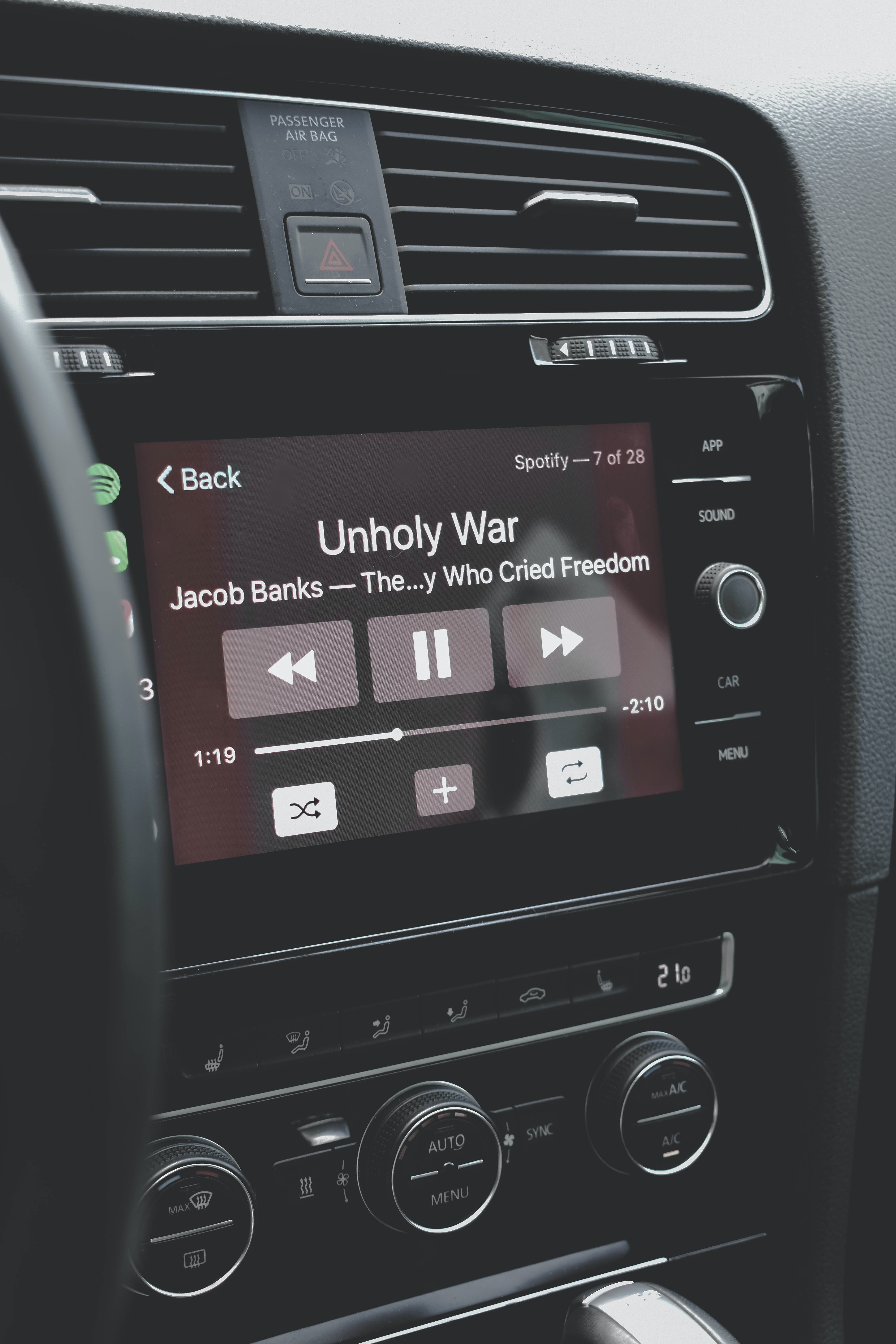
Infotainment systems in vehicles provide entertainment and climate control features.
Ultraleap recognised that driver safety was increasingly being put at risk with touchscreen systems becoming standard in most vehicles.
They wanted to show that mid-air interaction can help counter the risks associated with advanced infotainment systems.
Mid-air terminology
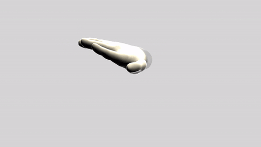
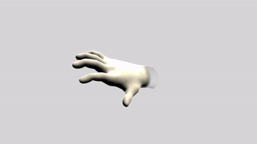
Mid-air gesture
A particular hand movement performed in the physical space around you.
Mid-air haptic
A vibration pattern felt on the hand after being hit with high-frequency ultrasound.
Represented as green dots in the video.

The task
Create an application that demonstrates the benefits of controlling an infotainment system using mid-air gestures and haptics.
The design process
The project would require a full end-to-end user and business-centred approach to ensure the demo was fit-for-purpose.

Driver survey
We needed to find out:
Most common driver environments
Usage levels of in-car system features
Most common interaction methods used
I created a survey that was sent out to 100 drivers from our target demographic.
It started with simple questions, before asking them to describe how they complete certain tasks.


Stakeholder interviews
Business Development employees were interviewed to gain an understanding of our automotive clients’ needs and priorities.
Each shared their thoughts on the existing demos and what the next automotive demo should include.
Workshop
Data from the survey and interviews was utilised in a workshop held to help decide the use cases to focus on.
Participants included members of Product, Sales, Engineering and Design teams to gain a range of perspectives.

Existing UI review
It was important to understand what was currently being used in vehicles, so I placed photos of existing UIs on office walls for us to regularly refer to.
UI, feature and terminology patterns emerged across each of the manufacturers.


My ideation sketches
Wireframes & storyboards
I digitised sketches and produced a few variations of content, layout, and interaction design.


Mid-air gestures
Used to interact without looking at the screen. I selected these gestures as a starting point.
Tap
Confirm
Grab
Back to Home
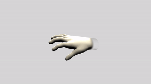
Pinch
Increase / Decrease
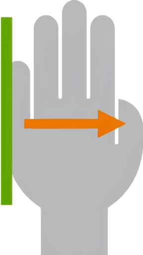
Swipe
Next Menu Item
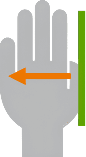
Twist
Previous Menu Item
Mid-air haptics
I designed these vibration patterns to provides feedback to the user's hand following a successfully executed mid-air gesture.
Expanding Circle
Confirm
Collapsing Circle
Back to Home

Adaptive Circle
Increase / Decrease
Hand Scan Right
Increase / Decrease
Hand Scan Left
Previous Menu Item

Low-fidelity prototyping and usability testing
I used a low-fi prototype to test early designs internally very quickly, using a budget driving simulator set-up approved by Nottingham University's automotive dept.
I tested with 6 non-technical participants that had no involvement with the project.
High-fidelity prototyping and user testing
The new gestures, haptics and UI designs came together to form the next prototype.
This time, it was more realistic and tested with 8 members of the public that had no prior knowledge of the technology so the results were more valuable.
Example tasks:
Increase the temperature
Skip a track
Answer a phone call


Findings from user testing round 2
Navigating through many features and menus was the biggest issue.
The 'swipe' gesture was too unreliable and tiring to perform repeatedly to move through options.
Users often forgot where they were in the menu, so had to glance at the screen before navigating.
Revised design
I reduced the number of features by only keeping the 4 most frequently used functions in the menu: volume, temperature, fan speed and sat nav.
2 new ways of navigating between the features were also introduced:
Showing a certain number of fingers to select a feature (a "finger pose").
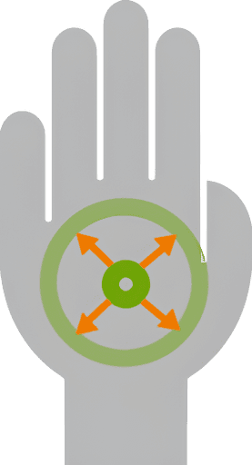
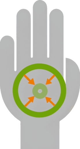
Using the pinch gesture and moving it in 4 directions to control a radial menu.
I also:
Reduced the number of menu layers down to 1.
Reduced the number of core gestures down to 3.
Added audio feedback so users were more confident they'd selected the correct feature.

Finger pose menu

Radial menu
Round 3 of user testing
I tested the both versions of the 3rd iteration with 8 more different members of the public. I decided to test them being used at a desk and whilst driving to see if there was any difference in preference or task performance.

Radial menu (preferred at a desk)

Finger pose menu (preferred whilst driving)
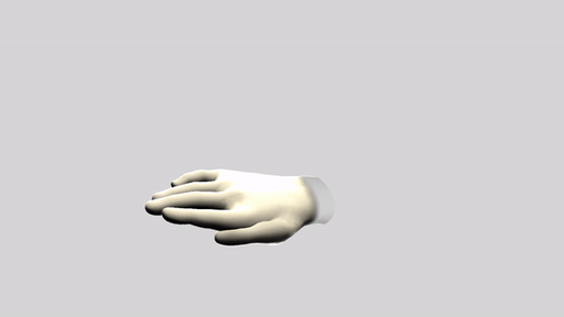
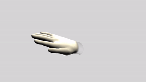
The final UI
The 3rd user testing around was very successful and we decided to keep both the finger pose and radial menu versions, even though using finger poses to navigate was easier whilst driving.
The UI's ability to be used as a touchscreen when stationary also helped it stay convincing.
Play the video to see it in action.
Pinch
Increase / decrease
(volume, temperate, fan speed)
Grab
Exit feature / end phone call
Tap
Pause / play music
Answer phone call
Project outcome
We had created a demo that was:
useful, realistic, easy to use, reliable, and unique.
confidently taken to customers, investors and international events.
illustrating the benefits of mid-air interaction to automotive partners.


Plus…
I worked with Peugeot-owned DS Autos to utilise the same interactions in one of their new concept cars.
My project design process was published in a HCI journal.
The research for the demo was used to form Ultraleap's automotive design guidelines.